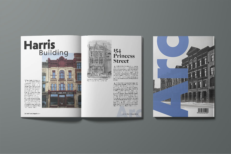
This project is called Arc because the main focus is on architecture, and it also shows the arc of these buildings from when they were first constructed to where they are now. Blue is used to match the sky, which is often featured in architectural photos. Blue is also cool, soothing, and secure. The sans-serif font is bold and simple and pairs well with the Serif font. Both fonts work well at a variety of weights.


This project is really about appreciating the merge of modern and historic architecture. It shows incredible examples of buildings that have been restored and combined to create something new and unique that still highlights the original.