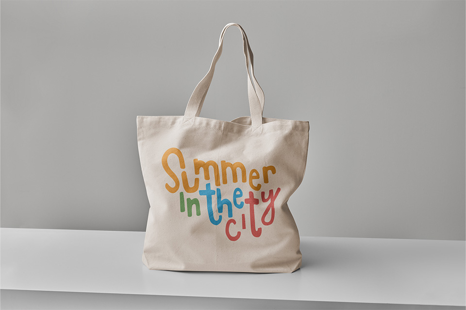
Summer in the City is a fun event for the whole family and the re-brand reflects this. The colours still tie into the old logo but it brings a fun new twist with the playful handwritten type. The logo is fun without feeling like it’s just for kids.


Summer in the City aims to show off local arts and entertainment, giving artists a chance to display their works and demonstrate their talents. The hand rendered type shows this playful and artistic side of Summer in the City.
The new logo still feels warm and playful when displayed in black and white. This t-shirt shows the versatility of the logo and the feel of the festival after the sun goes down.
